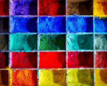
The best colors for websites are those which they best suit the content and style of your website. To take it a step further, the best colors for websites are those that feel and look right in their environment. In defining the best color for a website, there are three relevant factors to consider: content, style and environment.
Content:
When defining the best colors for websites, it’s necessary to consider the content, that is, the text, images, links and other elements that make up the content of your website.
Style:
Often, the best colors for websites are those that help convey the style of the website. For example, if your website is a personal blog, using bright colors can help convey the mood, style and tone of your blog.
Environment:
The third factor is the environment, the place where the content on your website is displayed. For example, a website designed for a personal blog might look best if the colors are bright and bold, whereas a website designed for a corporate or government website will look better if the colors are dull and soothing.
So, what colors should you use for your site?
The best colors for websites are those which the best suit the content and style of your website. To take it a step further, the best colors for websites are those that feel and look right in their environment.
Choosing color themes
The best colour theme for your website depends in part on what you want your website to do. If you want to sell stuff, you probably won’t want to use colours that are too bright or too unusual. On the other hand, if you want to start a conversation, or if you’re an artist, or if you’re promoting an edgy cause, you might want to use colours that express your point of view.
If colour is a medium, then a website is an image. Your image colour should complement your medium, not compete with it. If you’re writing a blog, for example, you probably won’t want to use a bright colour, however cool, because your readers will have a hard time reading. A dark or muted colour can make your blog easier to read. On the other hand, if you’re selling art, bright, vivid colours will probably help sell.
But colour is deeper than that. Colour is a mood. Colour is a message. Colour can, in other words, be a part of your advertising, but not the only part.
You can’t go wrong by concentrating on blue, orange, and green. These colours are complementary to each other. Complementary colours don’t look as good together as they do on white, but if you look carefully, you will notice them wherever you go. Other colours are complementary to oranges. Yellows and reds and blues are complementary to greens, and violets and blues and greens to yellows, and so on.
If you pick a color, you should think of what colors are complementary to it. For example, a dark red is complementary to blue, and yellow is complementary to green. If you do this, your web pages will look much more cheerful. But beware of trying to mix complementary colors. If you do, you will end up with muddy browns or purples, which look ugly. When you pick your site’s colors, you should also keep in mind the psychology of color. Choose colors that make people feel good. Blue is associated with strength, blue, green, and orange with stability, blue, red, and yellow with energy, and orange, red, and yellow with warmth.
The psychology also explains why some colors are more expensive than others. Blue, red, and orange are more expensive than greens, and blue is most expensive of all.
So, if you want the cheapest colors, go with greens. But if you want colors that make people feel good, go with blues and oranges.
Tips for choosing website colors
The entire purpose of most websites is to entertain visitors, or to persuade them to do something: shop, download, donate, sign up — anything.
Design plays an especially important part in this. The colors on a website can strongly affect a visitor’s impression of it.
Website colors can also trigger emotions. Red is the color of danger. Orange is the color of fun. Green is the color of nature. Blue is the color of trust. All of these are powerful psychological triggers.
The trouble comes when designing a website. It’s easy to fall into the trap of thinking that the website’s colors should be the same as the company’s logo. But that would be a mistake.
Another problem with using the company’s colors is that logos come in many styles. If the company’s logo has a classic serif font, you shouldn’t use a classic serif font for the main text on your website.
In theory, it is easy enough to decide the right colors for a website. In practice, it is much harder. You have to balance several factors: the company’s brand, the nature of the website, the emotions you want users to feel, and the nature of the products.
Useful resources to help you find and choose colors
To judge about color, you should first learn to see color, and then learn to choose it.
The most basic skill you need to learn to see color is basic color vision. Everyone has it, but most people don’t know they have it. If you have normal color vision, you see three kinds of light. The first kind is light we see with our eyes; we call this visible light. The second kind is light that our eyes can’t see. This light travels in the infrared and the ultraviolet, and scientists call it infrared and ultraviolet radiation. Infrared and ultraviolet radiation, like visible light, are electromagnetic waves.
The third kind is light we can’t see. This light travels through matter, and we call that light infrared and ultraviolet radiation. Normal color vision is more complex than this, of course. There are also different kinds of color vision. There are two kinds of color vision, for example, that we call dichromats and trichromats. Dichromats can’t perceive the red and blue components of white light; they see only variations in the brightness. Trichromats, on the other hand, can see all three components of white light.
Most people have dichromat vision. But once you start noticing color, you can learn to see with trichromat vision. Color vision is a mental process, and you can learn it like any other mental process. It is something you have to practice. There are several ways to practice. Some authors advise seeing the world through monochromatic light. Light is by definition a wave, and visible light consists of light that has the same frequency. Monochromatic light has just a single frequency. So to see color, you should see the world through monochromatic light.


