For a long time, digital illustration was associated with expansion. More colors, stronger gradients, sharper contrasts and increasingly complex lighting became standard across editorial illustration, advertising and entertainment design. Modern software made it possible to use almost unlimited palettes, and visual intensity gradually became one of the dominant signs of technical sophistication.
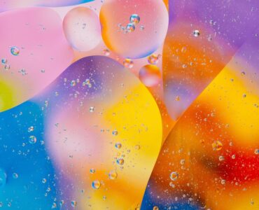
Today, many contemporary illustrators are moving in a different direction. Instead of embracing unlimited chromatic possibilities, artists increasingly work with restricted palettes, muted tones and carefully controlled color systems. Entire compositions are sometimes built around only two or three dominant hues, while saturation is reduced to allow atmosphere, texture and spatial rhythm to carry the emotional weight of the image.
This shift is not simply stylistic minimalism. It reflects a broader change in how visual storytelling functions inside contemporary digital culture. Audiences are constantly exposed to hyper-saturated imagery through social media platforms, streaming interfaces, advertising systems and endless scrolling environments. Color is everywhere, often competing aggressively for attention. As a result, many illustrators have started treating restraint itself as a powerful emotional tool.
Color Restraint as Emotional Control
In contemporary illustration, limited palettes often create stronger atmosphere precisely because they remove visual excess. When fewer colors compete inside a composition, viewers become more sensitive to subtle tonal changes, texture variations and emotional pacing. The image feels quieter, but often more psychologically focused.
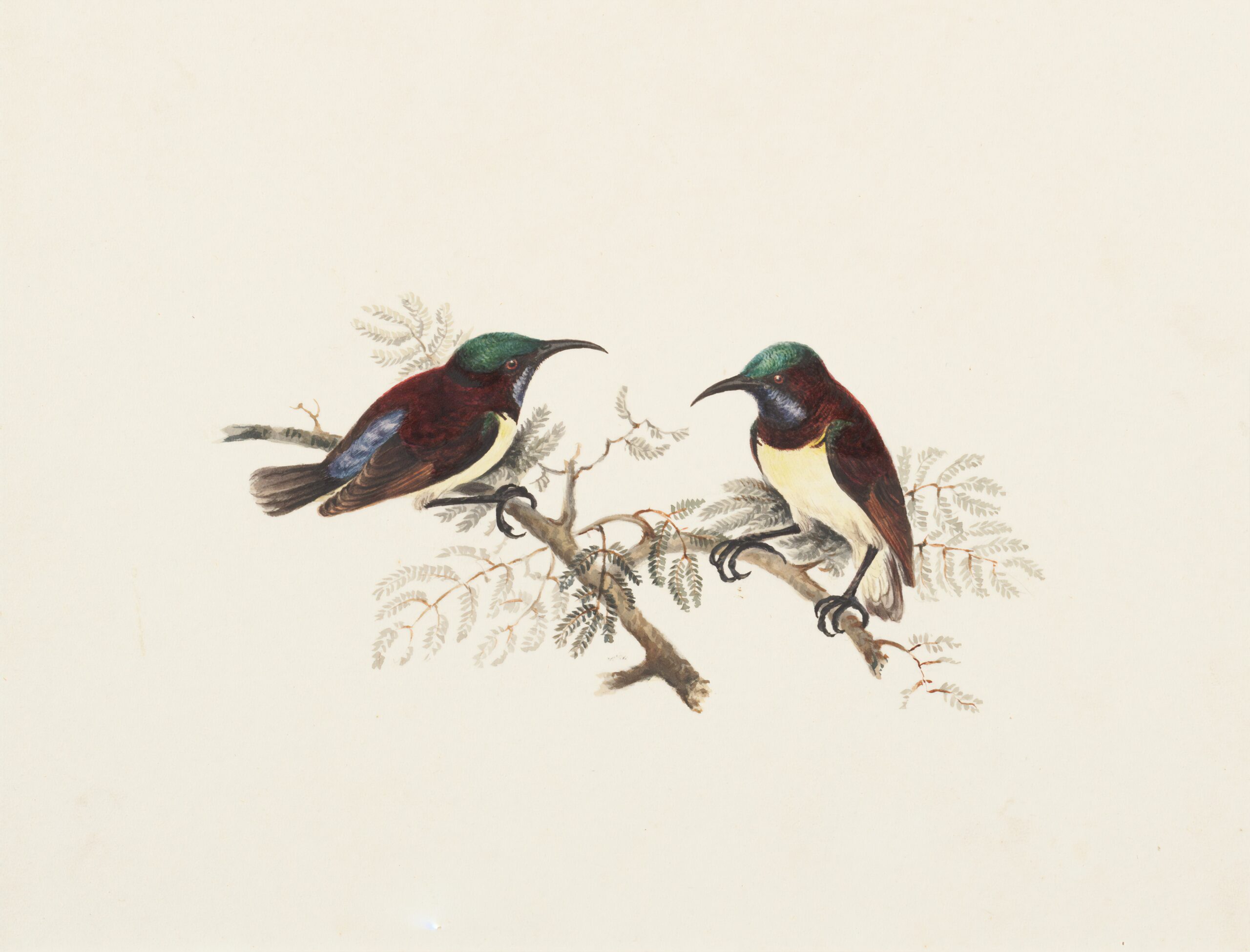
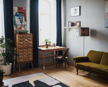
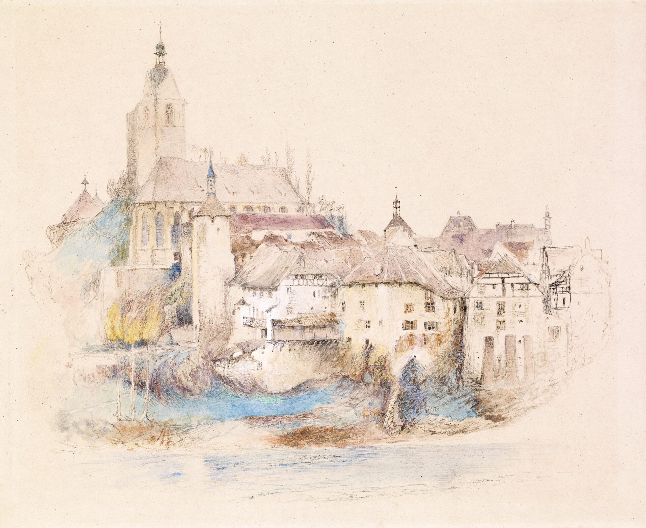
Muted blues, dusty reds, pale greens and low-contrast neutrals now appear frequently in editorial illustration and narrative digital art because they create emotional continuity rather than visual fragmentation. A restricted palette can communicate stillness, melancholy, tension or intimacy far more effectively than highly saturated compositions filled with competing chromatic signals.
Many contemporary illustrators approach color less as decoration and more as emotional architecture. Instead of asking how vibrant an image can become, they ask how controlled a visual atmosphere can feel. In this approach, color limitation becomes a narrative decision rather than a technical restriction.
This cinematic understanding of color has become especially visible in modern illustration influenced by film language. Like cinematographers, illustrators increasingly use controlled palettes to shape psychological tone across an entire composition. Slight changes in warmth, shadow or saturation suddenly become emotionally meaningful because the overall chromatic system remains restrained.
The Influence of Analog and Print Aesthetics
The growing popularity of minimalist palettes is also connected to renewed interest in physical print culture and analog visual processes. Risograph printing, screenprinting, independent publishing and old editorial illustration traditions continue to influence contemporary digital aesthetics. These mediums historically relied on technical limitations, yet many modern artists now value them for their discipline, texture and emotional clarity.
As a result, fully digital illustrations often imitate the feeling of limited-ink printing, faded magazine pages or imperfect color layering. Slight misregistration, muted surfaces and restrained chromatic interaction create a sense of tactility that highly polished digital rendering often lacks.
This attraction to analog aesthetics reflects a larger desire for material presence inside digital culture. Perfectly optimized visuals can feel emotionally distant because they erase traces of process and physicality. Restricted palettes, on the other hand, often suggest time, touch and intentionality. Images begin to feel constructed rather than infinitely generated.
Younger illustrators are especially drawn to this kind of visual discipline because it creates unpredictability. When color options become limited, composition, rhythm and negative space become more important. Artists can no longer rely on saturation alone to hold attention. The image must communicate through atmosphere and structural balance.
That limitation frequently produces stronger storytelling. Restriction forces clarity of intention. Every color inside the composition becomes more emotionally visible because the palette is controlled so carefully.
Slower Images in an Accelerated Visual Culture
Another reason minimalist palettes have become increasingly important is the changing speed of visual consumption. Most digital images are now designed for instant readability. They appear quickly, communicate immediately and disappear into endless streams of content almost as fast as they arrive.
Many contemporary illustrators are consciously resisting that rhythm. Controlled color systems create slower visual experiences that contrast sharply with the overstimulation of modern digital platforms. Instead of demanding immediate reaction, these illustrations encourage observation and emotional immersion.
Muted palettes also shift attention toward texture, lighting and spatial relationships. When chromatic intensity is reduced, surfaces begin to carry more emotional weight. Shadows become more atmospheric, empty space feels more deliberate and subtle tonal transitions gain psychological importance.
This is one reason contemporary illustration increasingly feels cinematic rather than decorative. Images are designed not simply to attract attention, but to sustain mood over time.
In many cases, minimalist palettes also create stronger authorial identity. Highly saturated digital illustration often becomes visually interchangeable because many artists use similar rendering techniques and visual effects. Restrained color systems, however, establish mood immediately. Certain illustrators become recognizable through carefully controlled tonal worlds rather than visual intensity.
Some build entire visual languages around faded monochromatic blues, warm desaturated browns or pale industrial grays. These systems create consistency through emotional coherence rather than repetition.
Emotional Precision Through Limitation
The growing role of minimalist color palettes reflects a broader transformation inside contemporary illustration. Artists are becoming less interested in demonstrating unlimited digital possibility and more interested in creating focused emotional experiences. Restriction is no longer viewed as absence. It becomes a method of concentration.
Minimal palettes remove distraction and allow atmosphere to emerge more clearly. Instead of overwhelming the viewer with chromatic information, they create space for subtle emotional interpretation. A single muted tone can sometimes communicate more than an entire spectrum of saturated color.
That is why restrained palettes have become so influential across editorial illustration, animation, poster design and narrative digital art. They allow images to feel quieter, more tactile and emotionally sustained inside a visual culture dominated by speed and excess.
In many ways, contemporary illustrators are no longer asking how much color digital tools can generate. Increasingly, they are exploring how little color is actually needed to create memory, atmosphere and emotional precision.