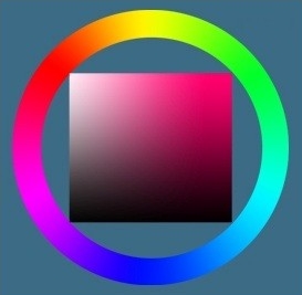
This is our color wheel. I realize that it looks a little unfamiliar, but that’s because we’ll also be talking about color saturation and hues. If you have experience with Adobe Photoshop or PaintTool SAI, then you are familiar with this wheel.
The outer ring of the color wheel is the so-called hues. The square inside corresponds to a particular hue (in this case, pink) and also shows the degree of lightening/darkening/saturation of a particular color.
Auxiliary Colors
These include the remaining colors created with Primary and Secondary colors. There are an infinite number of shades, so I’m not going to demonstrate them all. Some of them include Magenta, Blue-Green, Gold, Turquoise… you get the idea.
Now let’s take a closer look at the inner square. The area at the top of the square is the lightest, the area at the bottom of the square is the darkest. Now be careful… The closer the color is to the upper right corner, the MORE saturated it will be. The closer the color is to the lower-left corner, the LESS saturated it will be.
This is important because many young artists make this mistake of choosing only in the dark – light-scale, they forget to change the saturation and hue. Changing all three parameters of your palette makes your color scheme more interesting. That’s the basics – the minimum of things you need to know about color theory. Let’s move on.
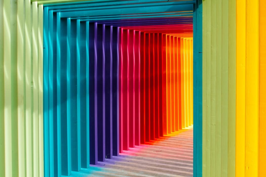
Now let’s talk about complementary colors. Complementary colors are colors that are placed against each other on the color wheel. Note that the color wheel you saw before was not quite right in this regard. This color wheel is the classic version familiar to many people. In most programs, for a number of reasons, the color wheels are non-standard… so if you want to choose complementary colors, use this one.
The complementary colors “complement” each other – they stand out when placed against each other – as they are opposed to each other. The complementary colors on the wheel are linked by lines.
Similar colors
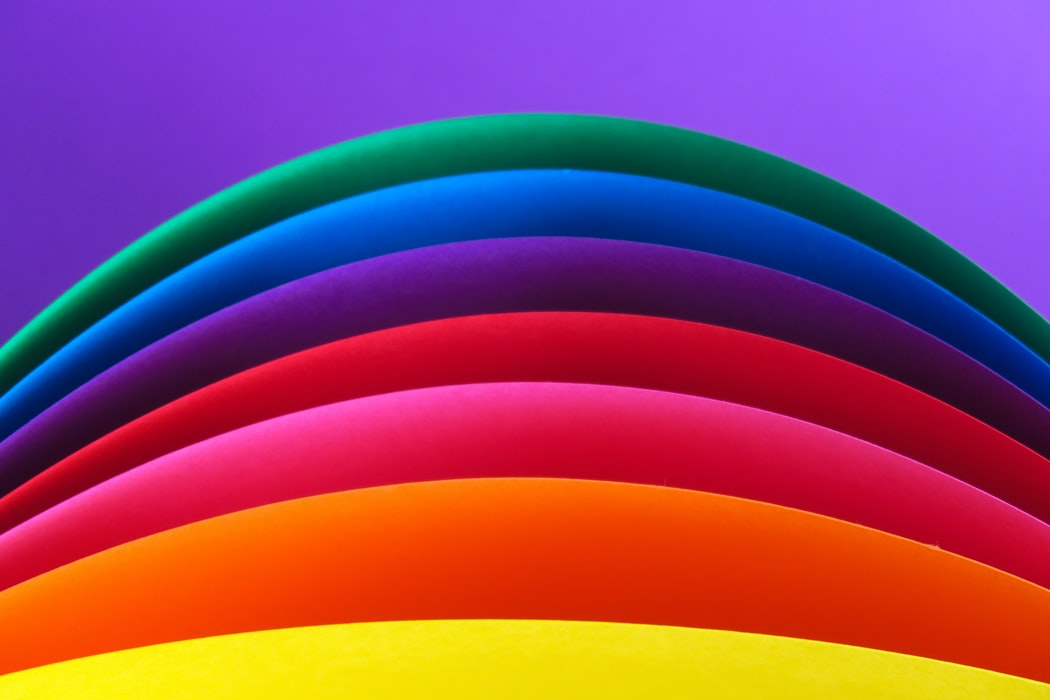
Similar colors are those colors that are adjacent to each other on the color wheel. For example, Orange to Red, Red to Pink, Red to Pink according to the wheel are considered similar colors because they are colors of the same hue, they are very pleasing to the eye.
Active Colors vs. Passive Colors.
Warm colors (reds, yellows, pinks) are ACTIVE colors. Cool colors (blues, greens, purples) are PASSIVE. In most cases (but not always), the light in the drawing will refer to the active row, while the shadows will refer to the passive row. This is at least what most people hold – but it’s not a fact. And we move on to the next topic.
Atmosphere.
Many artists either forget about it altogether or can’t come to a consensus on the subject. You can, of course, assume that all light is “active” and all dark is “passive” and even, in this case, your drawing will turn out well. But it’s not a question of simply accepting that fact. Colors have a “weight” or atmospheric quality.
When choosing a color palette, keep the atmosphere in mind. If your painting depicts a damp dungeon, you may need more blue/purple/pink/red shades in the palette. If you’re depicting a field flooded with sunlight, you might choose more green, yellow and orange shades. Temperature also affects the palette. If your “deep muddy cave” is not moist and warm, but cold and wet, you’ll probably want to add light blue light instead of vibrant red. If your field is flooded with the bright light of the morning sun, you’ll probably choose a light yellow light instead of the deep orange that’s usually used to depict early evening. You don’t have to worry too much about atmosphere and temperature – but you do have to consider them when choosing a color scheme.
Now, let me give you some very helpful advice on choosing your color palette. Saturation is your best friend. Knowing all the color theories in the world won’t help you if your palette is too saturated or too dull. The trick is to use both saturated and unsaturated colors. The easiest way to do this is to choose different saturation levels for your lights and shadows.